the world’s leading technology conference
For many of us, the thought of trade shows immediately conjures up a visceral feeling of foot pain. Our Condit exhibit design team just got back from three days at CES (Consumer Electronics Show), the worlds biggest technology exhibition, and logged mileage just shy of marathon distance. So you can imagine our dogs are barking! Like in any race, we hit highs and lows, took in the scenery and supported our teammates.
supporting our exhibiting client “teammates” at CES
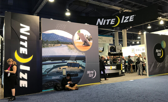
We don’t always get to see our shiny renderings come to life on the showfloor, but when we do you can bet we analyze the heck out of the functional, aesthetic and experiential aspects of the design. We visited our four client CES trade show displays: Nite Ize, Anova, PopSockets and Cochlear to see the designs come to life.
Nite Ize draws their crowd from effectively merchandising their vast product lines, however we learned we need to improve the flow into the booth – large graphic walls made the initial entrance intimidating.
Anova’s biggest success was an aesthetic redesign of their booth. The design mimicked a high-end home kitchen, allowing their customers to envision using the brand’s sous vide culinary gadget in their own home.
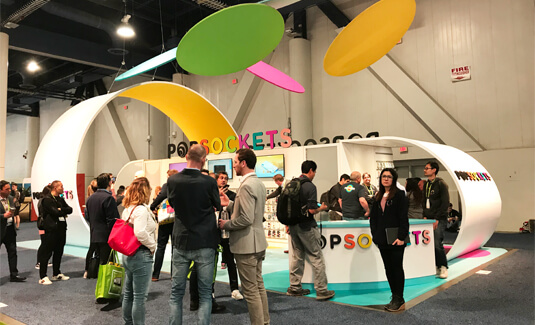
PopSockets made a splash in their new custom rental exhibit. The white backdrop allowed for their colorful products and branding to literally “POP”. Curved walls functioned as successful semi-private meeting areas while simultaneously adding to the aesthetic appeal. This booth showcased PopSockets’ spirit and brand essence as an innovative, unconventional and fun company.
For their first time exhibiting at CES, Cochlear’s booth held a consistent buzz! Thanks to both their dynamic range of booth draws–including a VR machine, stage with presentations throughout the week, and photo ops with the mascot–and to their popping yellow brand color. With a sea of black and white booths, Cochlear’s yellow exhibit was a draw in and of itself.
trend highlights at CES
All that walking didn’t just take us to our own work, the Condit design team analyzed the booth trends at CES 2019–what worked, what didn’t and what major trends surfaced.
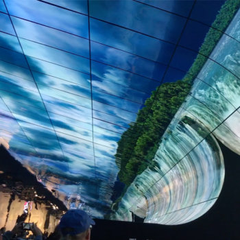
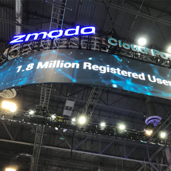
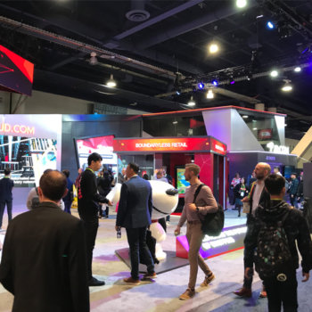
OLED screens and particularly transparent OLED applications were spotted throughout the show floor. This from of video presentation makes for dynamic animation and color effects. We also spotted excellent uses of LED screens as hanging signs.
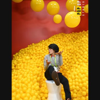
Photo booths proved the most popular booth draw, although not all were a hit. Photobooths with a 3D element or interactive piece proved most popular. The booths with longer lines at their photo booths translated to more lead captures!
Swag is out! Very few booths gave out literature or tchotchkes. We saw this as a progressive plus in reducing excessive waste.
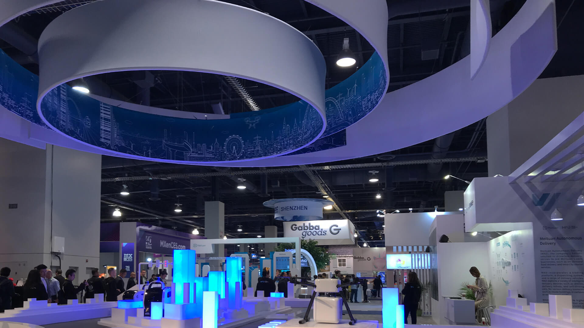
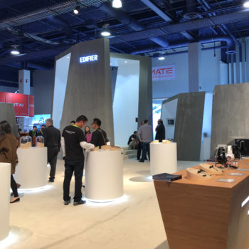
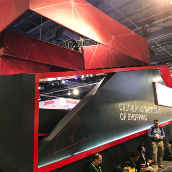
We saw an awful lot of black, white and red as booth colors. As for architecture, it seemed that bigger was better. Large, angular and asymmetrical architecture reigned supreme among the tech giants’ booths.
We were impressed with the success of booths offering multiple forms of engagement. Offering just a live presentation doesn’t cut it anymore. Media that caught our attention included directional sound, photo booths (again), curved monitors with outstanding content, audio campaigns on public transportation throughout the city and live podcast recordings.
why we go to trade shows
We travel to shows like CES not just to support our wonderful clients, but because we also want to observe what industry partners are doing. We believe attentiveness to industry trends, radical successes or epic failures in booth designs makes us better stewards of your brand for you marketing goals. We take pride in our craft and want to constantly improve in order to serve you better! Whether it’s for the latest Consumer Electronics Show, VMworld, or other technology and electronics trade show, we’re at the ready for when you want to start your next project. Or if you need more resources first, check out our exhibit technology offerings and portfolio of past projects.
